Friday, September 23, 2005
The view from central Canada?
Edited until I can better make my point. Or find better maps to highlight this misrepresentation. Having trouble finding maps with longs and lats and north pole.
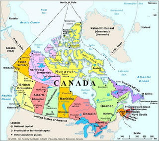
Artic circle is centered on this one. Just can't see the north pole.

Artic circle is left of center here this is the normal map seen everywhere. News Weather.
Artic circle is centered on this one. Just can't see the north pole.
Artic circle is left of center here this is the normal map seen everywhere. News Weather.

Comments:
<< Home
Notice how the Artic circle is centered on the one on the left.
What left? Don't assume things appear on everyone's screen the way they do on yours.
The one on the right shows where the north pole is situated on the majority of maps representing Canada today with the artic circle being left of center.
Huh?
The Arctic Circle is "left of centre"? Left of the centre of what?
Not only does the north pole need to be centered dead center top
Why?
For example if your perspective was from GreenLand and you still wanted Canada in the picture NL would appear at a glance to be further south,
NL IS south of Greenland.
Really wasn't ready for a proper post on this yet, but seeing as WJM can't see the misrepresentatin of Eastern Canada on maps and weather forcasts I decided to do a preliminary post.
Eastern Canada isn't misrepresented. The eastern and western edges on a conical projection are bound to be further "up" on the page, BUT UP IS NOT THE SAME AS NORTH!!!
That's basic map literacy.
Are Vancouver, Vancouver Island, and the Queen Charlottes not also "misrepresented" by that standard?
The Mercator projection is the one that has serious misrepresentation problems, especially in latitudes like Canada's. The conical projections much more accurately portray the relative sizes and shapes of land masses, than Mercators do.
Just compare, for example, Banks Island and Newfoundland on the conical projections, and again on the Mercator. (Banks is the large Arctic Island just to the west of Victoria Island; Victoria has the Nunavut-NWT border running across it.)
Banks Island is only 70,000 km2, compared to 109,000 km2 for Newfoundland. You can see on the conicals that Newfoundland is larger than Banks... but on the Mercator, you'd think it's the other way around. Look too at Southhampton, at the northern limb of Hudson's Bay (it's roughly shaped like Newfoundland)... on the Mercator it looks almost the same size as Newfoundland, when in fact it's just a little over 1/3 the size.
If you want inaccurate maps to complain about, though, try asking the provincial government when they are going to stop "insetting" Labrador.

I really don't know why I bother responding to you?
Your missing the point, its not about proportion but more about incorrect placement in relation to the incorrect placement of the North pole on the map.
Can we agree on one thing were in the Northern Hemisphere?
Your missing the point, its not about proportion but more about incorrect placement in relation to the incorrect placement of the North pole on the map.
Can we agree on one thing were in the Northern Hemisphere?
Your missing the point, its not about proportion
If you want the Mercator map to be used, it becomes about proportion. Mercators distort proportion.
but more about incorrect placement in relation to the incorrect placement of the North pole on the map.
How is the North Pole "incorrectly placed"?
How is any other place on those maps "incorrectly placed"?
WHAT'S INCORRECT?
Please forgive my inability to correctly explain my point here.
Maybe if maps had all of the lines of long and lat there, it would be more apparent to the layman. But as it stands with no lines of long and lat on weather maps and many other maps at first glance a conical representation of NL on maps is skewed to appear further north than their real position relative to the rest of Canada. Even if the lines were on maps and centered from a True north point of view the lay man would still interpret NL as being further north than its true position relative to the rest of canada. Its more about perception than the actual reality being portrayed by conical globe representations.
The fact is we live on a ball and it will can never be properly portrayed by a flat map. Whether the Mercural portrayal is used or the comical portrayal is used.
Would you not agree that the lines of LAt should be equal distances from the bottom or top however you look at it on both sides, left or right or East and west? To give a true representation of land mass location relative other land mass locations.
Would you not agree that the lines of LAt should be equal distances from the bottom or top however you look at it on both sides, left or right or East and west? To give a true representation of land mass location relative other land mass locations.
On the maps you posted, the lines of latitude ARE equidistant! And every landmass on those maps is shown in its true location relative to "other land mass locations".
Which map do you think does NOT do this?
The problem here isn't the map, it's your ability to read maps.
On the maps you posted, the lines of latitude ARE equidistant! And every landmass on those maps is shown in its true location relative to "other land mass locations".
Which map do you think does NOT do this?
The problem here isn't the map, it's your ability to read maps.
You know what your right! I need a better map to highlight this.
I will ask you to look at the top right map and note where the artic circle is.
Until I find a better map highlighting the Latitude lines.
Thanks for pointing this out!
Dam near ready to Put this one into the arena of "let the games begin" :)
I will ask you to look at the top right map and note where the artic circle is.
Until I find a better map highlighting the Latitude lines.
Thanks for pointing this out!
Dam near ready to Put this one into the arena of "let the games begin" :)
I will ask you to look at the top right map and note where the artic circle is.
What do you mean, "top right"?
All four maps are in a column, stacked top to bottom.
On the three maps which show the Arctic Circle, they all show it in it's correct location: 66-32 north. The Arctic Circle has no "left" or "right".
What do you mean, "top right"?
All four maps are in a column, stacked top to bottom.
On the three maps which show the Arctic Circle, they all show it in it's correct location: 66-32 north. The Arctic Circle has no "left" or "right".
OOPs my bad your obviously using a screen resolution of 800 by 600 where as I'm using 1024 by 768. Will have to keep this in mind from now on.
I've edited the post until such a time I can find better maps highlighting my case.
Thanks WJM!
I've edited the post until such a time I can find better maps highlighting my case.
Thanks WJM!
Ummm... what difference does it make to the portrayal of Newfoundland, that the central meridian of the second map is off-centered?
The conical projection is nearly identical in both maps: Look at the angle of the south coast of Newfoundland relative to the edge of the map. It's the same. The fact that "Artic circle is left of center" is utterly irrelevant to the projection of the map; the map could be left-shifted instead of right AND NEWFOUNDLAND WOULDN'T LOOK ANY DIFFERENT.
The conical projection is nearly identical in both maps: Look at the angle of the south coast of Newfoundland relative to the edge of the map. It's the same. The fact that "Artic circle is left of center" is utterly irrelevant to the projection of the map; the map could be left-shifted instead of right AND NEWFOUNDLAND WOULDN'T LOOK ANY DIFFERENT.
If its so irrelevant why not make it right?
If you've ever done any orienteering you should know that 1 degree off over 1 km will set you off at your destination by 100 metres? Not sure exact numbers.
Just imagine what the discrepency of having the north pole of center by 30 degree's ? has on the location of NL over 5000 km?
Its so great that it is visually obvious!
If its so irrelevant why not make it right?
You can only make "right" things which are wrong.
Those maps aren't "wrong".
If you've ever done any orienteering you should know that 1 degree off over 1 km will set you off at your destination by 100 metres?
Why would anyone use a conical projection map like those, let alone one at such a scale, for navigational purposes?
Just imagine what the discrepency of having the north pole of center by 30 degree's ? has on the location of NL over 5000 km?
It has no effect on NL's location.
NL is located on the map right where it is, and right where it should be.
Its so great that it is visually obvious!
What, exactly, is "visually obvious"?
Post a Comment
You can only make "right" things which are wrong.
Those maps aren't "wrong".
If you've ever done any orienteering you should know that 1 degree off over 1 km will set you off at your destination by 100 metres?
Why would anyone use a conical projection map like those, let alone one at such a scale, for navigational purposes?
Just imagine what the discrepency of having the north pole of center by 30 degree's ? has on the location of NL over 5000 km?
It has no effect on NL's location.
NL is located on the map right where it is, and right where it should be.
Its so great that it is visually obvious!
What, exactly, is "visually obvious"?
Subscribe to Post Comments [Atom]
<< Home
![]()
Subscribe to Posts [Atom]
